
What Are the Primary Colors?
Some of us are taught that the primary colors are red, yellow, and blue:
While others claim that they are actually red, green, and blue:
While it's true that mixing red, yellow, and blue paints or inks can produce any hue, as can mixing red, green, and blue lights, the reality of it is a little more complex than that. Color printing uses four colors of ink: magenta, yellow, cyan, and black, with the last one not to contribute to any hue but rather to save money by using one ink instead of three. Indeed, if you look at paints or inks used for blending to make other colors, odds are the red one is slightly magenta and the blue one is more than a little cyan, much like the first set of color boxes above.
But to really understand color vision at the perceptual level, let's examine how the eye detects color and relays color information to the brain.
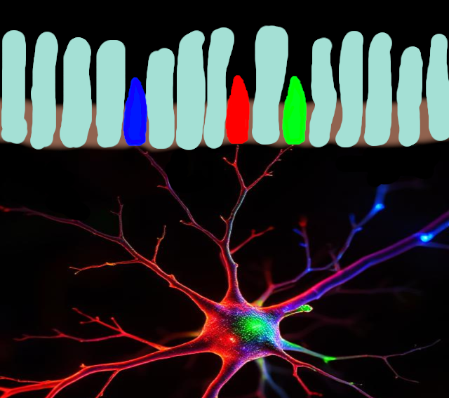
In the back of the eye is the retina, a layer containing nerves, blood vessels, and the dedicated cells whose function is to detect light, the photoreceptors. There are two main kinds of photoreceptors, rods and cones. We won't worry about rods right now, but the cones, for most humans, well, for most catarrhine primates (apes and most old world monkeys see the same colors we do), there are three types of cone, which for simplicity's sake we can call red, green, and blue. But of course color vision isn't that simple.
The three kinds of cone each contain their own flavor of opsin, a protein specialized for detecting light. A molecule of vitamin A is bound inside the protein, with a kink in the molecule, and when a photon hits it, the molecule springs back into its straightened form, causing the protein to change shape and a whole lot of signalling to happen within the cell that ends with an electrical signal being sent to a nerve. This is why vitamin A is important for good vision.
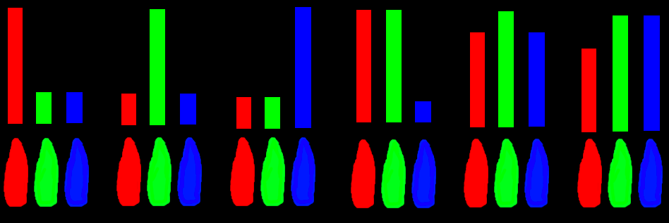
We can plot on a chart how sensitive each type of cone is to different wavelengths of light. This gives us what's called a spectral curve. The numbers on the graph represent the wavelength in nanometers (nm), or billionths of a meter. Vitamin A on its own would respond mainly to ultraviolet light, and would show up as a sort of bell curve shape in that part of the spectrum. But the opsin proteins push and tug on the vitamin A's electrons, shifting its spectrum into the wavelengths that we see:
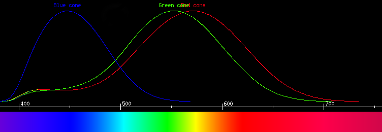
This graph shows that there is a problem with looking to the light spectrum to find primary colors. They simply aren't there. At no point on the graph is there a pure red, i.e. a signal from the red cones without any signal from the green or blue cones. Nor is there a pure green without any signal in the red or blue cones, nor a pure blue without any red or green. Every wavelength that we see activates more than one type of cone, so nowhere in the spectrum is there a true primary color. In fact, since all the light we see is part of this spectrum, it means we cannot see a primary color directly.
Do not try this at home!
This is NOT how they did it!
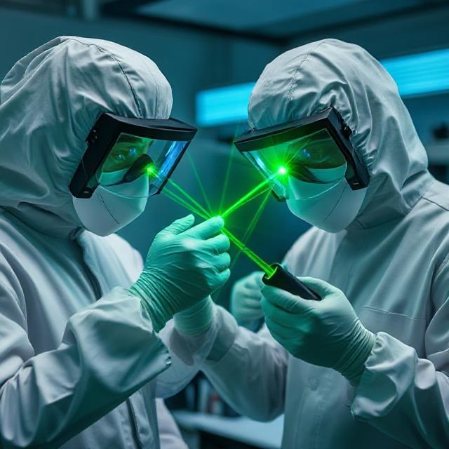
Not long ago as of this writing, a team of scientists shone lasers in their eyes with the goal of exciting only their green cones and not the other two kinds. The color they saw is described as a "blue-green of unprecedented saturation". It is reasonable to wonder why they would see a blue-green, but as we will see this is actually completely expected. To understand why, we must examine how color is processed by the eye and brain. Part of this process is described by the hue-saturation-luminance system of classifying color.
Colors have different hues such as blue, green, orange, red, purple, but each of these is not a single color but more of a range of colors. There are light greens and dark greens, bright oranges and pale oranges, bright blues and dark blues, reddish purples and bluish purples. The last of these is also a measure of hue, but the others vary by either saturation, which is how strong the color is, or luminance, which is how light it looks, or both. For example, a strong lemon-yellow color is much more saturated than a pastel yellow, even though both have about the same luminance, while a cobalt blue has much less luminance than a sky blue. The color seen by the researchers was extremely saturated because it had a very strong blue-green hue, stronger than what we're all accustomed to seeing.
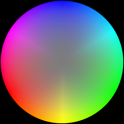
In this color wheel, hues are arranged around the circle while saturation increases from the center outward.
Another important part of how the eye and brain process color is described by the opponent process theory. The simplest form of the idea is that certain hues are complementary to each other, and that every hue falls along imaginary axes between hues. For humans and other primates, one of the axes is between reddish and greenish hues, while the other is between yellowish and bluish hues. A given color can be reddish or greenish, but not both; it can be yellowish or bluish, but not both.
There is a biological basis for this theory: inside the retina are neurons that connect to the cones and receive electrical signals from them. Each neuron has inputs that are either excitatory or inhibitory, which we can think of as "plus" and "minus". Some neurons connect their "plus" inputs to red cones and their "minus" inputs to green cones, and others are connected the other way around. So the signals these neurons send to the brain are either increased by reddish colors and decreased by greenish colors, or vice versa. Still other neurons have their "plus" inputs wired to red and green cones, and their "minus" inputs to blue cones, and still other neurons are wired with "plus" to blue and "minus" to red and green. These send signals to the brain that are either increased by yellowish colors and decreased by bluish, or vice versa.
There are also neurons in the retina that connect only to red and green cones, summing their signals, and conveying the result to the brain as a luminance signal. This is why saturated shades of indigo look dark while all shades of yellow, even the most saturated, look light.
When the researchers activated their green cones, their color-opponent neurons would have responded in a predictable way. The red-green neurons would have registered a strong greenish signal, since they were receiving a strong signal from green cones and nothing from red cones. We can think of this mathematically if we assume that the green cone signal was 100% of some ideal value, and the red cone signal 0%. 100 minus zero is 100, so we calculate that the perceived color was 100% greenish. But their blue-yellow neurons would also have responded. They get signals on one side from green and red cones; since the green cones were responding at the value we're calling 100% and the red cones were not responding very much at all, we can average them out and get a value of 50% for the combined red+green signal. The blue cones were also at zero percent response, so the blue-yellow neurons would have responded with a (50 - 0 = 50) = 50% yellow signal. The researchers also would have perceived a 50% luminance signal.
But how is it possible that the scientists saw blue-green if their eyes were telling them the 100% greenish light was 50% yellowish? Well, the names of colors aren't names of true pure primary colors, and each language has some cultural definitions for the color words. Colors that we call "green" actually stimulate red cones almost as much as green cones, so what we think of as green is perceptually more like greenish yellow or yellow without a reddish tint. Most shades of yellow are perceptually slightly reddish, since they stimulate red cones a little bit more than green cones. Blue is a vast expanse of perceptually bluish greenish hues, ranging from indigo shades that are only somewhat greenish to cyan and aqua shades that are perceptually barely bluish at all. A good representative shade of green might be around 535nm, which we can see from the graph excites red cones about 85% as much as green cones, and blue cones barely 10%, so doing the math for the opponencies we would get 15% greenish, 82.5% yellowish, and 92.5% luminance. This ratio of yellowish to greenish that we think of as a neutral green is about 11:2, so when the scientists saw a ratio of 1:2 it looked far less yellowish than what most people think of as green, therefore it looked bluish. It also had much less luminance than a pure spectral wavelength, so that's why they experienced a color of unprecedented saturation.
Because of the cultural definitions of the color names, scientists prefer to call the cones L (for long wavelength), M (for medium or middle), and S (for short wavelength) instead of red, green, and blue.
There is also a biological basis for hue. Inside the brain, the color opponent signals from the retina are processed and categorized by their ratios and there are dedicated neurons that respond to each hue. Your brain has a neuron for this hue and another neuron for this hue and another for this hue. When we learn to speak our first language, we form associations between these hue neurons and the words for certain colors. That's why we've tied the word "green" to neurons dedicated for this color and this color and this color even though the opponent processes that feed them have to specify certain amounts of signals we don't call "green" before the neurons will fire.
So even though there are no primary colors in the light spectrum, there are still colors we can see that have the same hue as an idealized primary color, just not as much saturation. So which hue is equal to that of true primary green? Which hues match those of the other primary colors? Well, from the theories I've described so far, we already have two different bases for what to call "primary". There are the hues that result from stimulating only one type of cone: primary red from L cones, primary green from M cones, and primary blue from S cones. But there are also the ideal hues where one opponent process is at an extreme while the other is at its neutral point. There are four of these, which we might call ideal red, ideal green, ideal blue, and ideal yellow. Even though there are three primary colors, there have to be four ideal colors, since there can't be an odd number. (Even if you count luminance as a third opponent process, it would have two extremes: ideal white and ideal black.)
So to get the primary hues, all we have to do is find hues that activate one type of cone strongly and the other two types equally. There is a way to do this, which is to take advantage of a phenomenon called invariant hues. Basically, when looking at a single wavelength of light, if its intensity be increased, its color will appear to shift. Red starts to look orange then yellow then white; violet starts to look blue; green starts to look yellow then white. But there are three wavelengths that don't appear to change hue as the intensity is cranked up - they only look whiter. These are called invariant yellow, invariant green, and invariant blue, and their wavelengths are 574nm, 508nm, and 473nm. (Source). These are the wavelengths where two of the types of cones are equally stimulated.
Primary vs. invariant hues.
For invariant yellow, the L and M cones are stimulated equally - let's call that 100% - and the S cones only negligibly - we'll call that 1%. For the opponent processes this means 99% yellowish, neither reddish nor greenish, and 100% luminance. Culturally, this is a slightly greenish yellow, but perceptually, it has the ideal yellow hue.
Ideal
Yellow
For invariant green, the L and S cones are stimulated equally, about 80% as much as M cones. This means the opponent processes would register only 20% greenish, 10% yellowish, and 90% luminance. So this is the same hue the researchers saw when lighting up only their M cones, except what they saw was much much more saturated. So while invariant green has the same hue as primary green, it appears yellower than the hue of ideal green.
Invariant blue has the M and S cones equally stimulated, with L cones at about 75%. So the red-green opponent process sees 25% greenish, and the yellow-blue opponency sees 12.5% bluish. The luminance is 87.5%. Invariant blue is not the same hue as any of the primary hues nor any of the ideal hues. Invariant blue is actually half as much bluish as it is greenish, just as invariant green is half as much yellowish as it is greenish. Therefore, the hue of ideal green is halfway between invariant green and invariant blue, corresponding to a wavelength of 490.5nm. Although your monitor can't display that pure wavelength, its hue looks like this:
Ideal
Green
Looks awful blue, doesn't it?
There should also be an invariant violet where L and M cones are stimulated equally and lesser than S cones. I'm sure it's there because I've seen it, but I don't have a way to measure its wavelength. It would be somewhere near the extreme end of the visual spectrum, at a wavelength of less than 420nm. Since this would correspond to equal L and M cone stimulation, its hue would match primary blue, and since it would be neutral along the red-green opponency axis, it would also correspond to ideal blue. Note this is not the same as invariant magenta, which is white light with wavelengths near 558nm taken away. Invariant violet would have equal L and M cone stimulation and higher S cone stimulation, the opposite of invariant yellow, while invariant magenta would have equal L and S cone signals, the opposite of invariant green.
To figure out primary red and primary blue will be trickier, to say nothing of ideal red and ideal blue. Primary red would be a mixture of wavelengths such that L cones would be stimulated strongly, while M and S cones would be stimulated less strongly but equally to each other. A nice deep red of 650nm is a good place to start; this is the color of most red laser pointers. A normal monitor can't display this color, since its red component is actually quite orangeish, so I've made the wavelength slightly purplish just there to compensate. This wavelength excites M cones about half as much as L cones, and S cones not at all, so we want another wavelength to bring S cones up to match M cones. Not knowing the invariant violet wavelength, let's just choose a 400nm wavelength to mix with our 650nm. The eye is not very sensitive to light at 400nm, so if we use a 1:1 ratio of intensity of 650nm and 400nm we should get about 50% as much S cone stimulation as L cones, and negliglibly more than 50% M cones. That will do for our primary red. After making an approximation of an approximation of an approximation, I present to you the following primary red hue:
Primary
Red
At this point it occurs to me that I've just recreated the yellow, cyan, and magenta of color printing. I swear it's a coincidence! And we're not done yet.
Primary red, if we could see it, perhaps using the same technique the scientists used to see primary green, would be perceptually 100% reddish, 50% yellowish, and 50% luminance. To get an ideal red hue, we'd have to balance out that yellowish with more bluish. Fortunately, S cone stimulation corresponds directly to bluish opponency, and 400nm wavelength increases S cone stimulation without appreciably shifting the red-green opponency, so we can just crank up the 400nm violet light. At a 3:2 ratio of violet to red, M cones will still be excited only a little more than 50% of L cones, but S cones should be at 75% of L cones. The red-green opponency will register a little less than 50% reddish, but the yellow-blue opponency will now register ((100% L + ~50% M)/2 - 75% S) = ~0%, just about dead neutral. Making another estimate of what this would look like, I give you ideal red:
Ideal
Red
Creezus jucking feist that's magenta.
At this point we have enough information to answer the questions what are the primary hues, and what are the ideal hues. And the answers are:
Primary
Red
Primary
Green
Primary
Blue
Ideal
Red
Ideal
Green
Ideal
Yellow
Ideal
Blue
Perceptually, the four ideal hues should look equidistant from the hues they aren't complementary to, but they don't. Given how much the ideal red and ideal blue look more similar to each other than to the other two, I can't help but wonder if I erred somewhere in the mixing of red and violet light. Nevertheless, 650nm red looks less yellowish than computer monitor red, and primary red would look less yellowish than that, and ideal red would look less yellowish than primary red, so this result must be close to the truth.
What this all means is that the magenta on your computer monitor is close to the hue of ideal red, the cyan is close to the hue of ideal green, none of the monitor's primary colors are particularly good approximations of your eye's primary colors, and only the yellow is perceptually close in hue to its ideal namesake. Color vision is f@$&%ing weird!